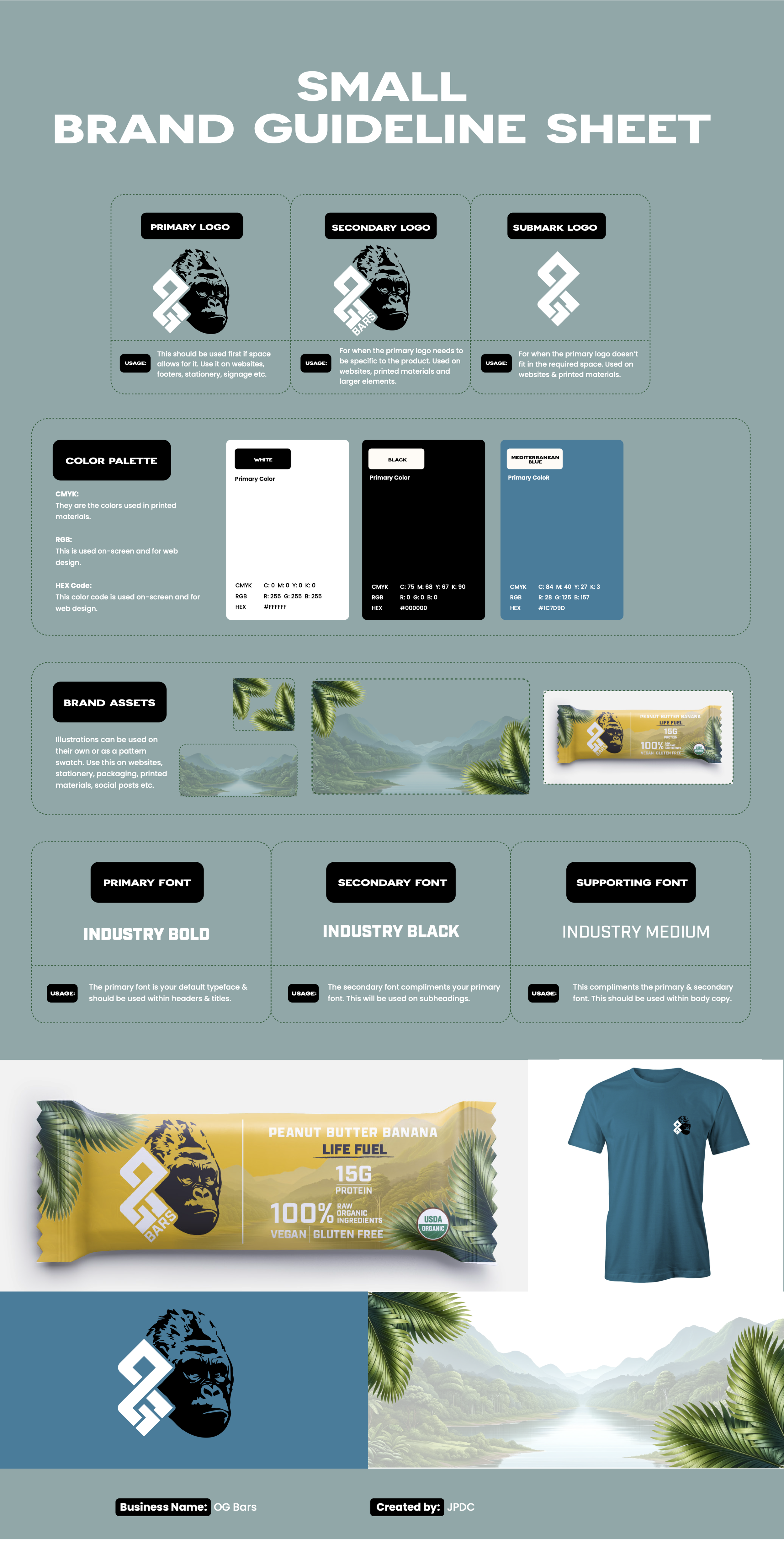
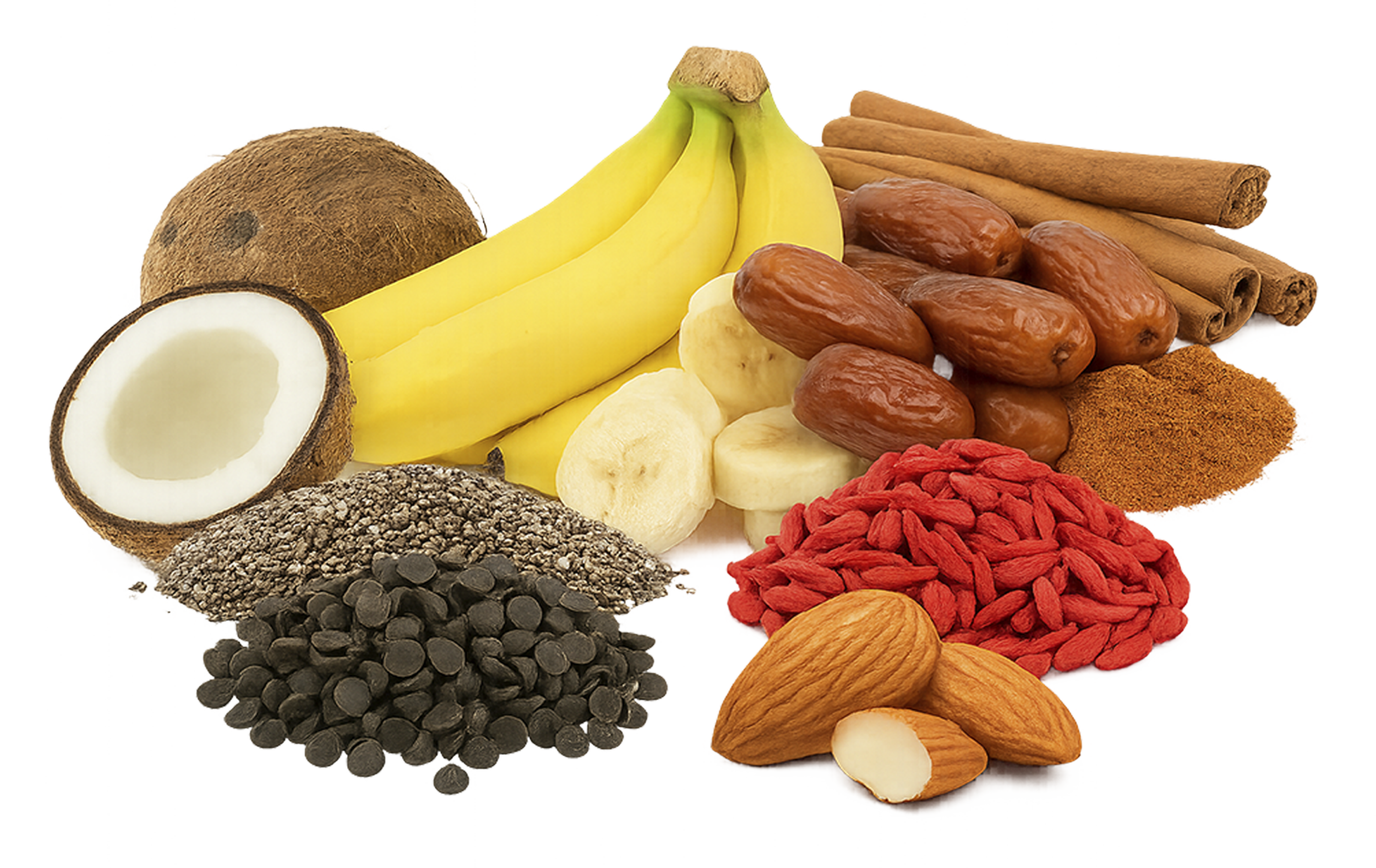
Brand Identity: Organic Gorilla stands for health, adventure, and pure nutrition. It uses earthy colors and a strong, modern gorilla logo. The brand’s goal is to support active lives with all-organic ingredients.
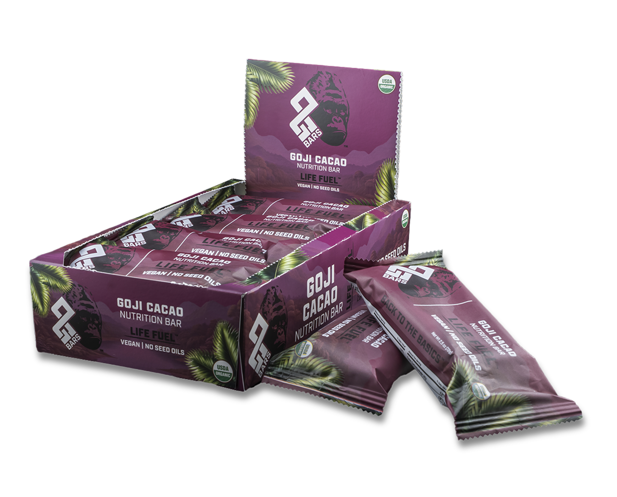
Packaging Design: Each bar’s wrapper features lively backgrounds, bright colors that match the ingredients, and clear organic labels. Hand-drawn textures and bold fonts emphasize the product’s natural energy. The tagline “Life Fuel” highlights its adventurous, healthy spirit.
Organic Gorilla – Brand Identity & Packaging Design
Packaging
“Unwrap the wild.”
Dynamic textures, bold typography, and organic callouts make the packaging as energizing as the product inside.
Tagline
“Life Fuel.”
A simple phrase that speaks volumes—fueling adventure, motion, and clean living.
Audience
“Made for movers.”
Targeted toward active, health-minded consumers who value performance and purity.


Logo Design
“Strength in simplicity.”
The gorilla icon is a powerful, minimal mark representing resilience and clean nutrition.
Color Palette
“Rooted in nature, sparked by flavor.”
A base of earth tones energized by vibrant colors pulled from real ingredients.
Typography
“Loud and clear.”
Strong, confident type choices express energy and action—never passive.